LIPTON TEA REBRAND
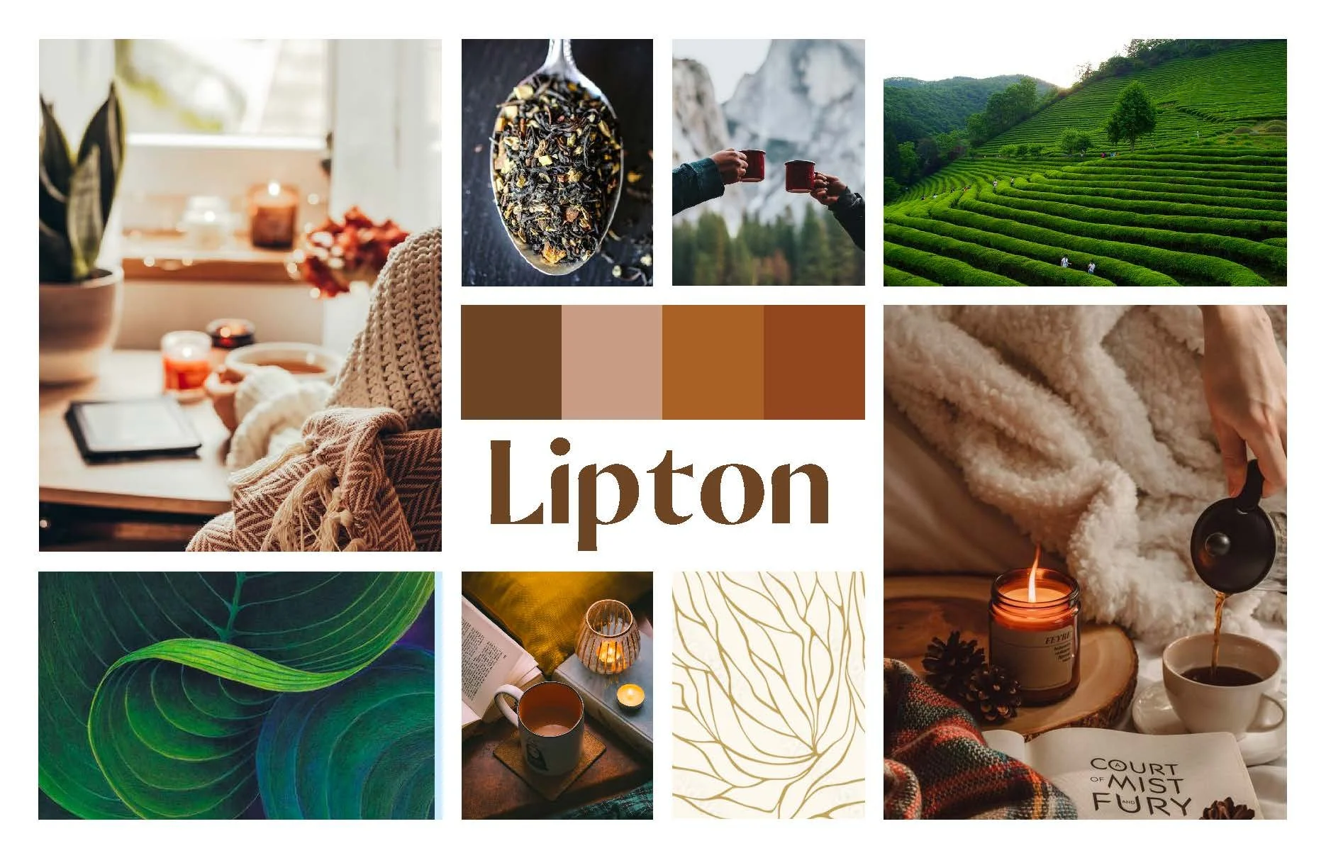
Lipton’s purpose has always been to bring others together and a smile to your face through a good ‘ol cup of tea. From farm to table, the rich and aromatic tea will not only brighten your day but also build connections.
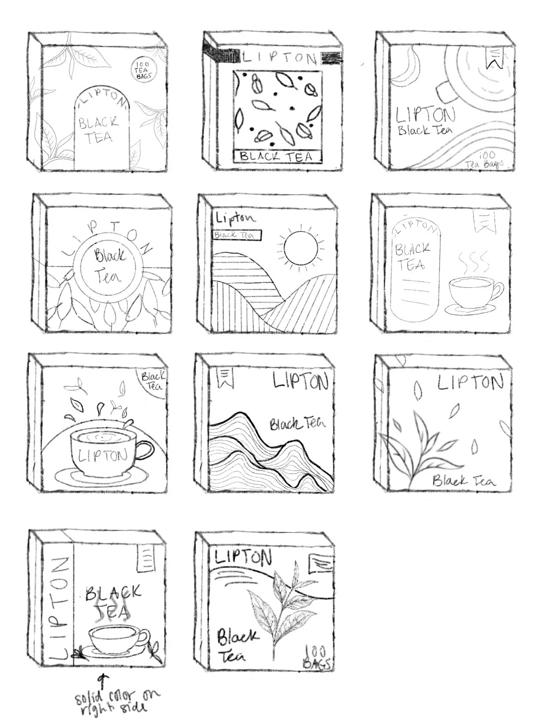
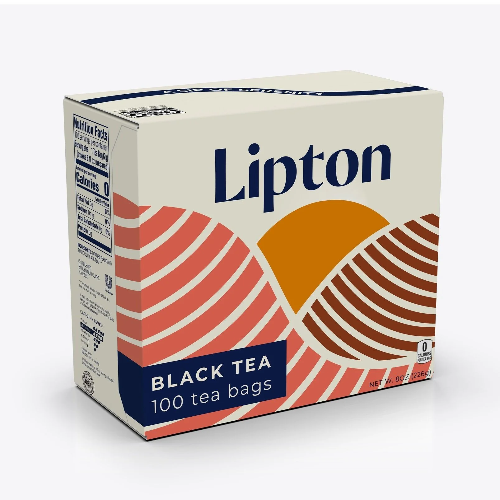
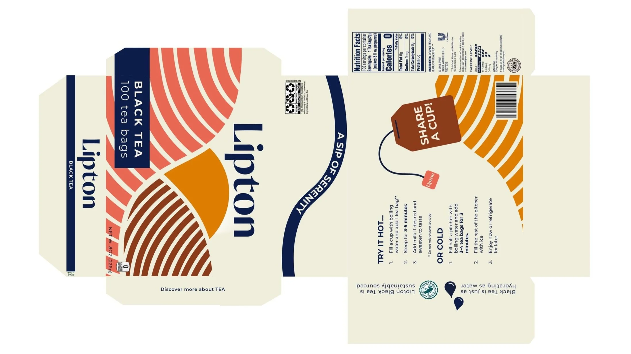
Throughout this rebrand I decided to address the color, hierarchy, texture and shapes found on the packaging design. By addressing these areas, I created a more cohesive, modernized branded packaging while still paying homage to the original roots of the brand. Click HERE to see the full final presentation.

Dieline

Social Media
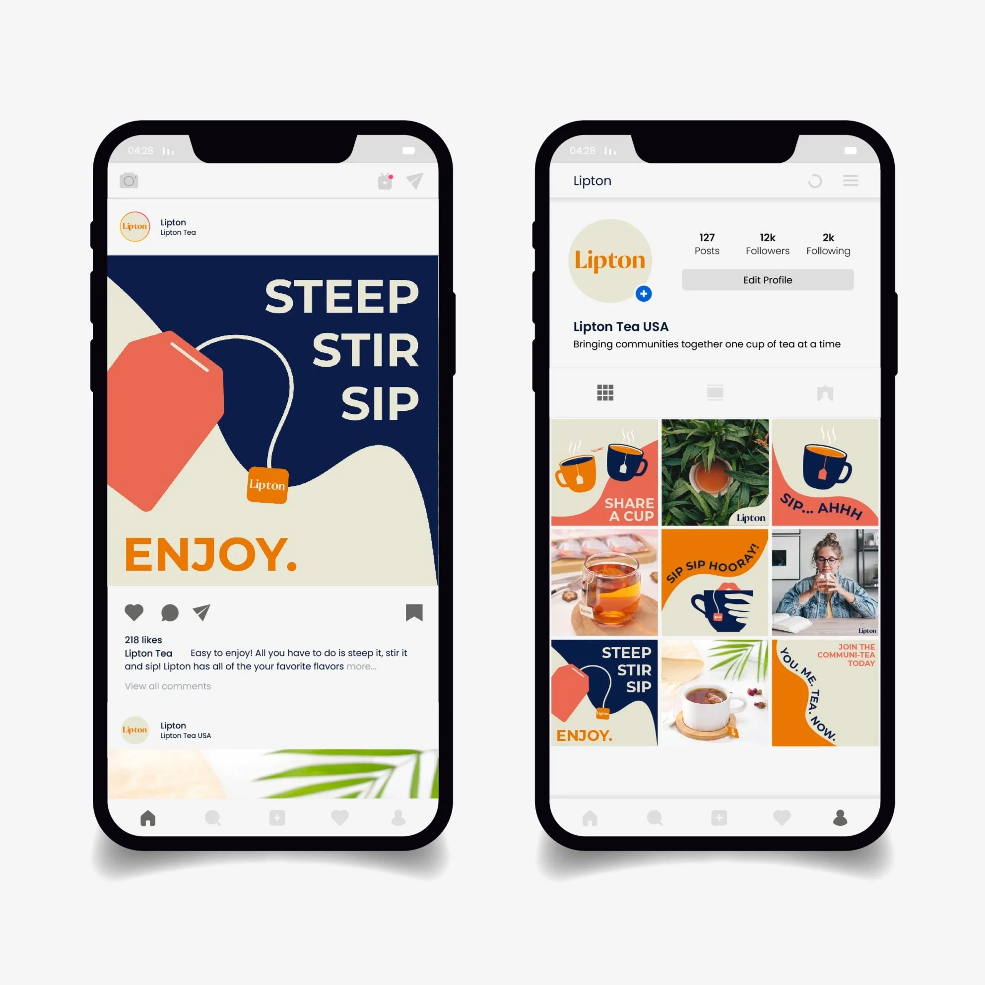
Another area of this rebrand was creating a new and refreshing social media presence to go along with the new packaging design concept.
Environmental Application
I was also tasked with creating an in-store end-cap display to experiment with different applications of the branding. I did this by calling out certain slogans, shelf shapes, and colors that also align with the social campaign.